
Hi, I'm Min Jeong!
UX Designer/Developer based in Zürich

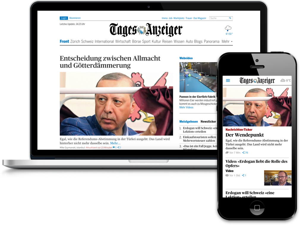
Interaction Design, Visual Design
January 2017


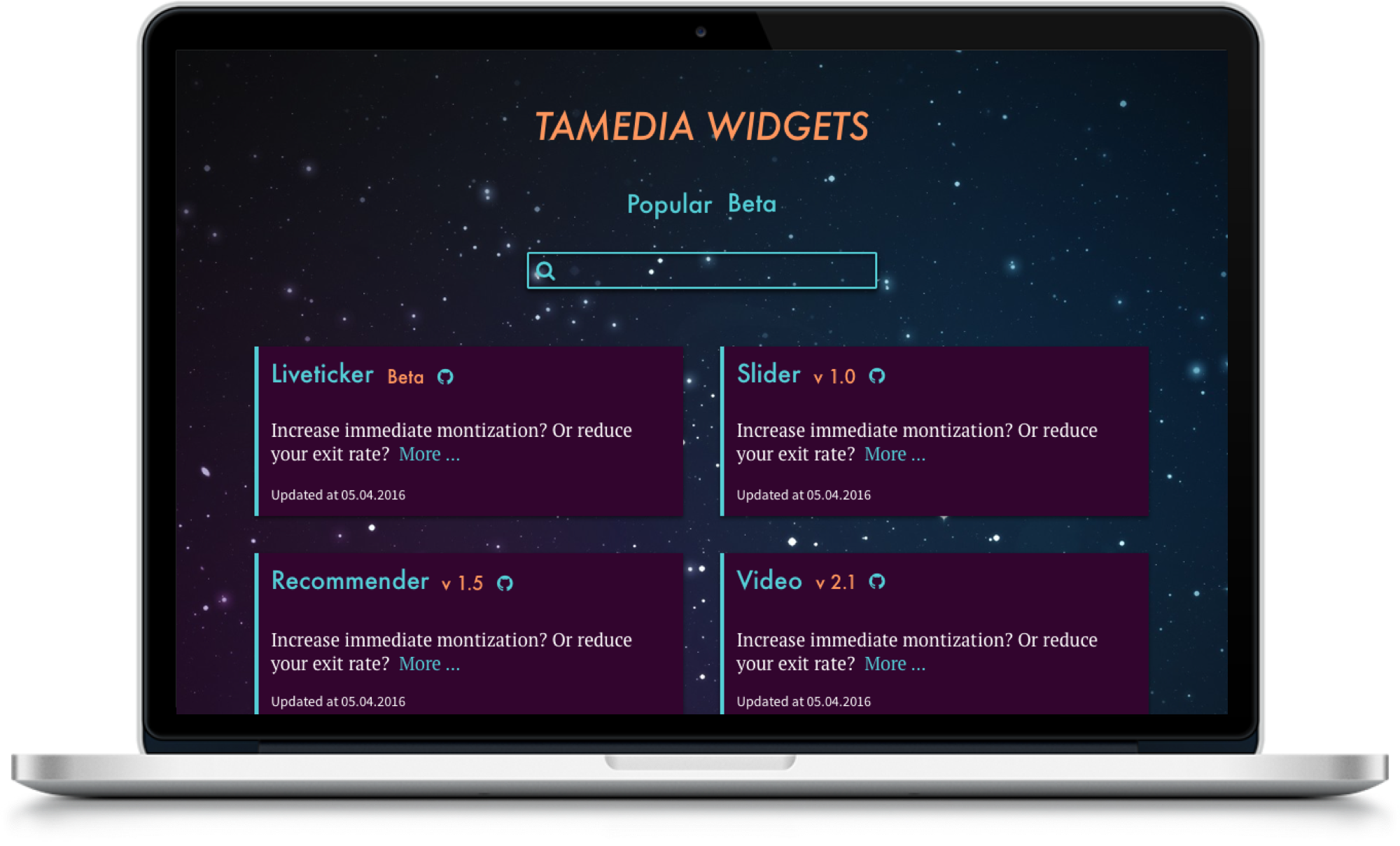
Interaction Design, Frontend Development
Spring, Summer 2017
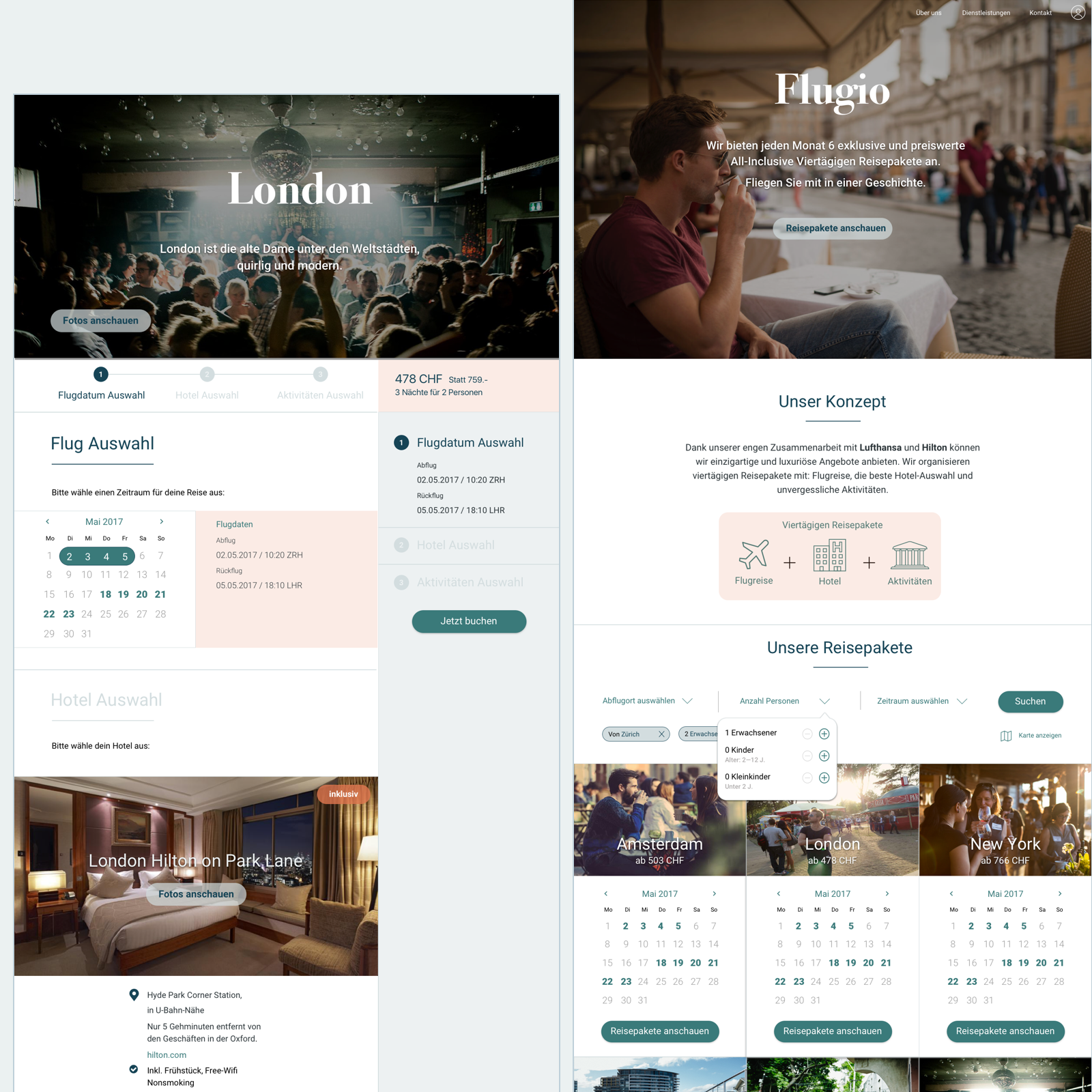
Interaction Design, Visual Design
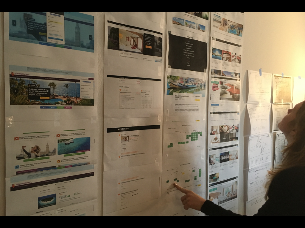
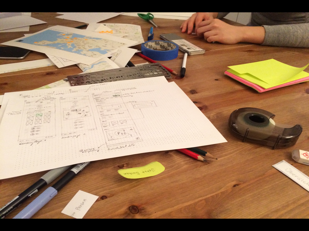
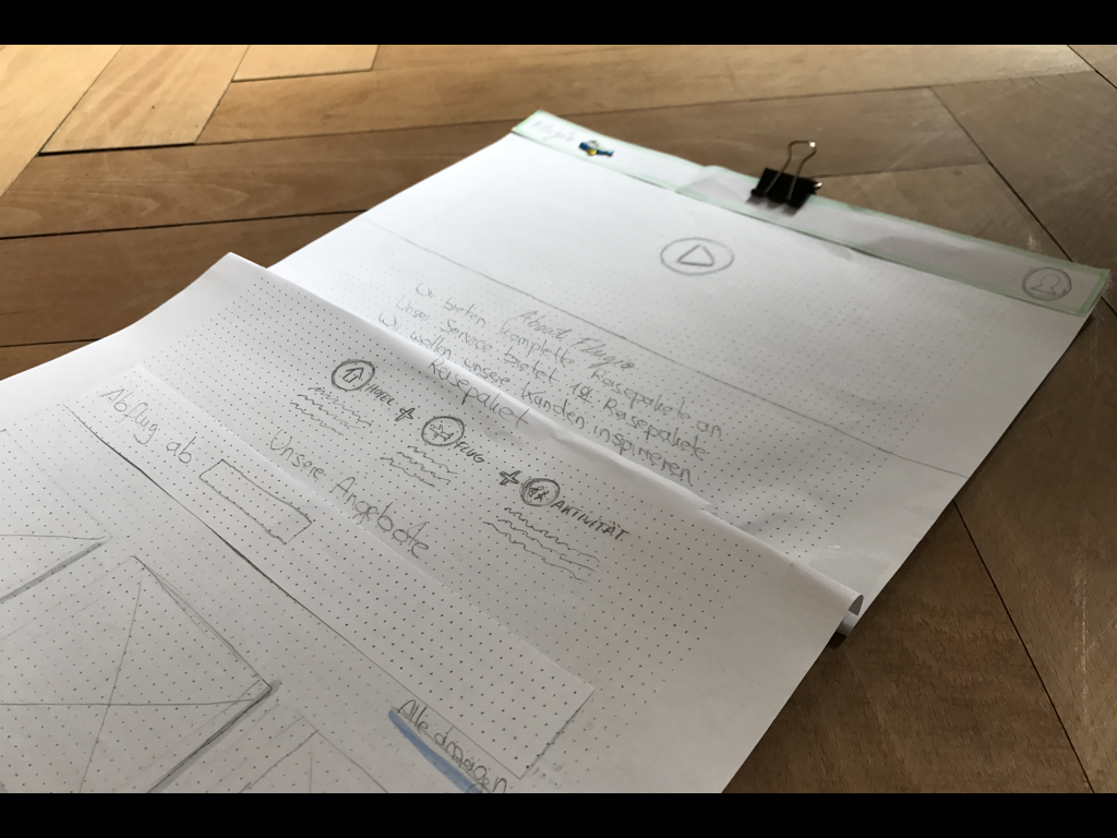
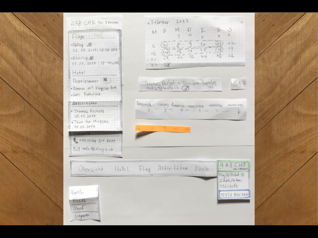
Dec. 2016 - Mar. 2017


Frontend Development
A project for Christmas 2016
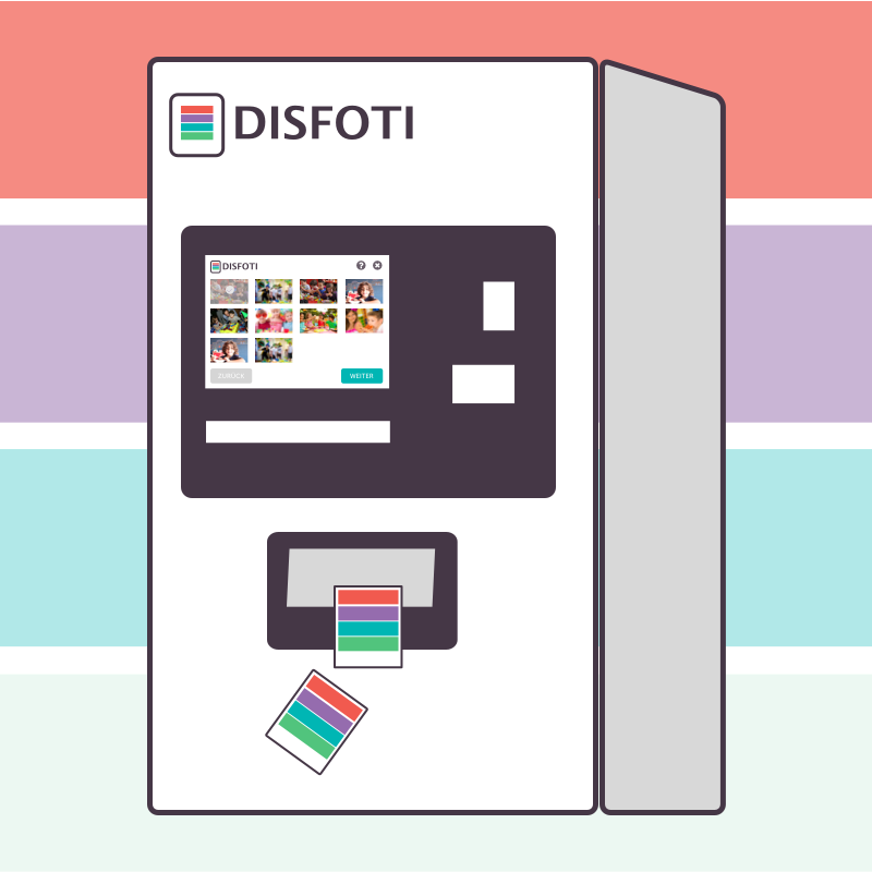
Interaction Design, Visual Design


Interaction Design, Visual Design


Interaction Design, Visual Design, Frontend Development
A graduation project of „Frontend Engineering“ at HSR, 2015
Frontend Development for mobile

Frontend Development